Leigh Art Trail 2023

This year I exhibited at the Leigh Art Trail with SEVEN Collective at the Refill Room. Our chosen theme for the year was ‘Seasons’ and we each produced 2 x DL concertina sketchbooks: one for autumn and winter; and one for spring and summer. For each season I also took inspiration from a different artist.

Autumn – inspired by Gustav Klimt

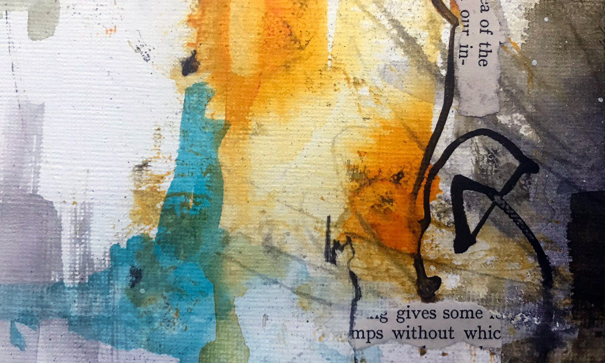
Using mixed media and collage, for me, Autumn is all about the rich colour palette of reds, oranges and golds.

Autumn sketchbook (inspired by Gustav Klimt)

Winter – Inspired by William Kentridge

The key visual element of winter, for me, is seeing the silhouette of skeletal trees against the sky.

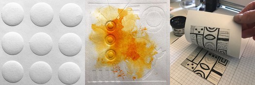
I had recently visited a William Kentridge exhibition at the RA in London and took inspiration from his use of old text pages for backgrounds and his simple drawn animations.

Winter sketchbook (inspired by William Kentridge)

I created my own simple, stop-frame-animation of trees blowing in the wind which you could see via a QR code on one of my sketchbook pages.

Spring – Inspired by Flora Bowley

My spring sketchbook was heavily influenced by the ‘brave intuitive’ approach of Flora Bowley. As spring was very late to arrive this year it was a difficult sketchbook to start, so I relied heavily on being intuitive. Spring, for me, is all about seeing new life in the garden. Green shoots appear along with springtime flowers: daffodils, tulips, bluebells and my ever-favourite Fritillaria flowers.

Spring sketchbook (inspired by Flora Bowley)

Summer – Inspired by Antonio Gaudi

Summer season, for me, is seeing an explosion of bright colours and patterns in the clothes people wear. This reminded me of Gaudi’s mosaics, in particular Parc Guell, Barcelona.

Summer sketchbook (inspired by Antonio Gaudi)

The Leigh Art Trail was on from 8-16 July.

#the100dayproject 2022

I completed #the100dayproject for the first time in 2021 where I decided to ‘print something everyday’ (you can read about it here). This year I have taken up the challenge again and I’ve chosen to print 100 4″x6″ photograms*.

*Photograms are created by placing objects directly onto photo-sensitive paper and exposing them to light. They use a camera-less photography technique and so don’t require a camera, film or an enlarger to create.

I was first inspired by Man Ray’s Rayographs and Mohly Nagy’s photograms while studying photography at Uni. I loved developing b&w photographs and would happily spend many hours in a darkroom.

My recent exploration into cyanotypes (also influenced by Man Ray and Moholy Nagy along with Karl Blossfeldt and Anna Atkins) has enabled me to develop similar photograms using UV light and water.

To make the process easier I made a mini darkroom in my house by converting a small utility room (that has no windows). I added a red safe light and a hanging line and I was able to develop my cyanotypes there.

Test prints drying in the darkroom

To take this a step further, for the 100 day project, I have bought photographic paper and black and white darkroom chemicals.

Darkroom chemicals – developer, stop bath and fixer

I’ve started my 100 day project with a botanical theme. Last year I divided the 100 days up into 10 x 10-day series, which worked really well for me, so I will do this again this year. I’ve also realised that darkroom developer doesn’t last very long once it has been mixed (2 days max), so I plan to make 10 prints in one darkroom session. Below is a selection of prints I made in the first session…

Days 1-10 various botanicals

My challenge started on Sunday 20 February and will end on Monday 30 May. You can follow my daily postings on Instagram #100daysof4x6photograms).

Handmade paper

I’d been given a set of old encyclopedia volumes to use for collage, as altered books or even to recycle as handmade paper. I decided I’d give handmade paper-making a go.

Encyclopedia volumes

I was intrigued as I’d been told that due to the age of the books, and the way they had been printed, that the letters were likely to stay intact rather than blend into a mushy grey (which digitally printed papers are more likely to do).

Internal page

So I started by tearing a few pages out of the books and ripped these into smaller pieces of paper. I left them to soak in a bowl of water for an hour or so before using an old kitchen stick blender (no longer used for food!) and blended the paper into a pulp.

Paper shredded, ready for blending

I experimented with a few different types of mesh for creating the sheets of paper. Then after watching a few online videos I found that car bodywork repair mesh worked brilliantly!

So I dipped the mesh into the watery/pulp and pulled it out, this gave me a layer of pulp on the mesh (the amount of water in the pulp affects how thick the paper will be: less water = thicker paper). I then needed to press out as much liquid as I could. Once I’d done this I flipped the mesh over and released the sheet of pulp onto a Jay cloth. I added a second Jay cloth on top to create a ‘sandwich’ and then repeated the process.

Sheets of handmade paper

The process was really successful (once I got the hang of it), and I was able to make quite thin sheets of paper. It was easy to build up a ‘sandwich’ of 10-20 sheets (this will depend on how much pulp you’ve made). I also like rough edges, so I didn’t worry about giving the paper straight edges, but this could be done by placing a frame onto the mesh before pulling out the pulp.

Letters are still visible

I really liked how the letters were visible on the paper. The level of detail in the lettering is affected by how long the paper is blended for. The less time spent blending = more definition in the lettering.

The next step now is to try blending different types of paper (basically I’ll be rummaging through my recycling paper bin for junk mail and packaging), this will hopefully add more colour and images to the paper. Plus I’d like to add seeds and petals and…the list goes on!

The Water Replies – Estuary Festival 2021

Back in March 2020 I signed up to ‘The Water Replies’ journal project, led by Metal Southend and Cement Fields, as part of the second Estuary Festival. The festival takes place along 107 miles of the South Essex and Kent coastline with artists, events and workshops responding to contemporary issues surrounding the estuary.

The project began just before the pandemic hit and the UK was put into lockdown. During lockdown, when everyone was confined to their homes, we were allowed to go outside once a day for solitary exercise. For me this meant a long walk along the seafront. I’m so thankfully to have the estuary and beach a few minutes walk away from my home.

As contact with the outside world was reduced, I found that during my daily walks or runs along the estuary, I became more focused and mindful on what I saw and what captured my attention. The tidal times change daily. The mud flats appear and disappear. Sunlight glistens on the water. Big skies. Bold silhouettes of the pier and groynes…etc

For my journal I wanted to record my impressions of the coastline beginning at Southend Pier and travelling along the coast towards the QE2 bridge. I chose landmarks and areas of interest along the way: the pier, Gypsy bridge, incoming tide patterns, barnacles, silhouettes, sea birds, beach textures, seaweed, shells, Two Tree Island, views across to Kent, Coryton oil refinery, QE2 bridge…

This is a selection of pages from my journal:

Journal cover – The Water Replies
Silhouette of the groynes
Abstract map of the estuary
Gypsy bridge
Beach textures
Vintage postcard of Southend-on-sea

You can view a short turn-the-page video of all the journals entered into the exhibition at: www.estuaryfestival.com/water-replies-films.html

If you are in the area, find out more about the Estuary Festival, which runs from 22 May – 13 June 2021. Enjoy!

#the100dayproject completed

I started the 100 day project on 31 January 2021 and completed it on 10 May 2021. Wow 100 days! It sounded like a long time when I started, and May seemed like such a long way off. And yet, here I am, and the project is finished. In reality the time flew by and I had a lot of fun along the way.

At the start of the project I made the decision to break down the 100 days into 10 mini-projects. And having decided I would print something everyday, I chose a different print method to explore every 10 days. I think this really helped to keep me motivated and to keep the project interesting.

Here is a selection of the prints I made:

Days 1-10: Lino printing
Days 11-20: Drypoint etching on a mini 3d-printed printing press
Days 21-30: Monoprinting
Days 31-40: Collagraph printed with a gelli plate
Days 41-50: Gelli printing
Days 51-60: Printing with found objects
Days 61-70: Screen-printing
Days 71-80: Cyanotype
Days 81-90: Image transfer
Days 91-100: Xcut Xpress printing press

You can view the full project on Instagram at #100daysofmarkmakingwithprint and read more about the 100 day project in my earlier blog post.

I really enjoyed something about each printing process and would find it difficult to choose a favourite. I plan to take some time to reflect on what I have learned in this process and to notice what I enjoyed the most (or didn’t enjoy!) as I decide the next steps in my printmaking journey. Do you have a favourite printing method?